
Trip’d Travel Application
BrainStation Capstone Project
Overview
Role | UX Researcher/Designer
Tools | Figma, Invision
Research Methods | Usability Testing, Competitive Analysis, Exploratory Interviews
Client | Education BrainStation UX Bootcamp
Scroll ↓
Trip’d is a native iOS application designed to help last-minute travelers find activities on the go without the pressure of advanced planning. This was my first opportunity to explore the entire UX process from brainstorming to a high fidelity prototype and developed my passion for UX research.
In my role as UX Researcher and Designer, I created a working Figma prototype and conducted research to understand needs and gauge usability.
Design Process
As this was my first foray into UX design, I wanted to follow a more traditional process to help form a strong foundation using best practices. I used the Double Diamond design process to design trip’d, which has four distinct phases: discovery, definition, development, and finally delivery. From research to design, this method encourages collaboration and rapid iteration.
Research Methods
Problem Space Primary Research
Explorative Qualitative Interviews
Usability Testing
Discover
Exploring the Problem Space
Travel and tourism is one of my passions, so when given a chance to design any digital application, I knew I wanted to focus on travelers. Although travel is a saturated digital market, I knew that there still had to be unique pain points that were not being tackled. I started my preliminary research on Millennial travel trends and found that especially in this tumultuous pandemic travel space, travel is being booked with a much shorter lead time. Traditional travel apps cater to an advanced planner, not the spontaneous Millennial traveler I was focusing on.
Problem Space
Millennial travelers start researching their leisure trips online 0-21 days prior to departing and are frustrated by the lack of flexibility and accurate itinerary information for last-minute trips
78% of Millennials list flexibility as their top priority when deciding to travel within the next year
Some companies provide last-minute deals, but traditional travel outlets cater to 60+ days advanced planners
Travelers looking for a more spontaneous experience often miss key booking dates
Preliminary Research Insights
-
![Millennial Image]()
Millennials Travel More
Millennials and Gen Z are traveling more than other generations, exceeding the global total. Millennials are also spending more and prioritize saving for travel.
-
![]()
Influencers
Social media is often the first place that Millennials turn to plan their trips. Embracing Instagram, Facebook, TikTok and YouTube influencers will capture Millennial’s needs.
-
![]()
Flexibility is Key
The traditional search window has shrunk to an average of 0-21 days. So providing flexibility such as cancellation, date modification and more protection is key.


Design Challenge
How might we enable Millennials to increase flexibility when booking last minute travel in order to avoid missing out on time based travel opportunities?
Does This Make Sense?
My hypothesis was: Millennial travelers are frustrated by the lack of last-minute options.
After conducting preliminary research to guide my discussion, the next step was to hear directly from my users! I designed and conducted 30 minute one on one interviews to gain further understanding of my problem space and build empathy with my users.
Recruitment Criteria
I reached out to users who met the following criteria:
Millennials ages 23-40
Must who book within 30 days of travel
Booked a trip in the last year
Key User Insights
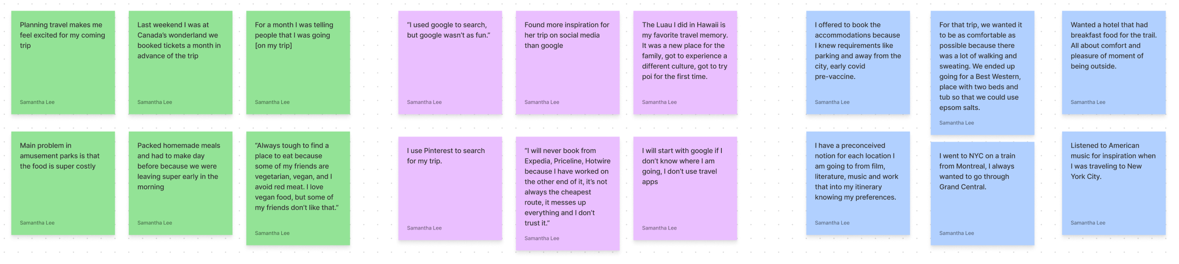
“On vacation my time is my own, therefore I am not on a schedule.”
— Interviewee 1
“I like planning last minute because you don’t know where you will end up and you will find new things that way.”
— Interviewee 2
“Planning ahead puts too much pressure on the trip.”
— Interviewee 3
Pivot!
My research did not confirm my hypothesis. NONE of my participants were frustrated by the lack of last-minute options, in fact, they all appreciated the opportunities last-minute travel provided! This proved an important lesson to go with the flow! I wasn’t afraid to pivot my research questions and change my designs to meet my user needs.
Revised Design Problem
How Might We… inspire last-minute Millennial travelers to incorporate spontaneity and discovery into travel planning?
Define
After getting to know my user, I incorporated all of my research in the definition phase and turned it into my persona who would help guide my design decisions. I would like to introduce you to my persona... Katherine!
User Stories
With Katherine in mind, I crafted user stories to explore functionality. User stories grounded my design decisions and ground them in direct benefits.

Task Selection
Using agile methods, I paired down my user stories into overarching epics which can be completed in a manageable amount of time. I focused on the epic “finding an activity” as my primary focus because it tackled Katherine’s core pain points around overwhelming searches, availability and her goal to find the best places in a city. I translated these user stories into 4 distinct screens for my user to cater to Katherine’s needs and connected them with user decisions to create my primary task flow.

Develop
Getting Ready for Testing
Next, I looked to existing application components, functionality, and design decisions to inspire my prototype. I organized my findings on an InVision moodboard and incorporated designs that aligned with my research.
-
![]()
Discover Page
-
![]()
Mood Quiz
-
![]()
2nd Mood Question
-
![]()
3rd Mood Question
-
![]()
Final Mood Question
-
![]()
Matches
-
![]()
Result Details


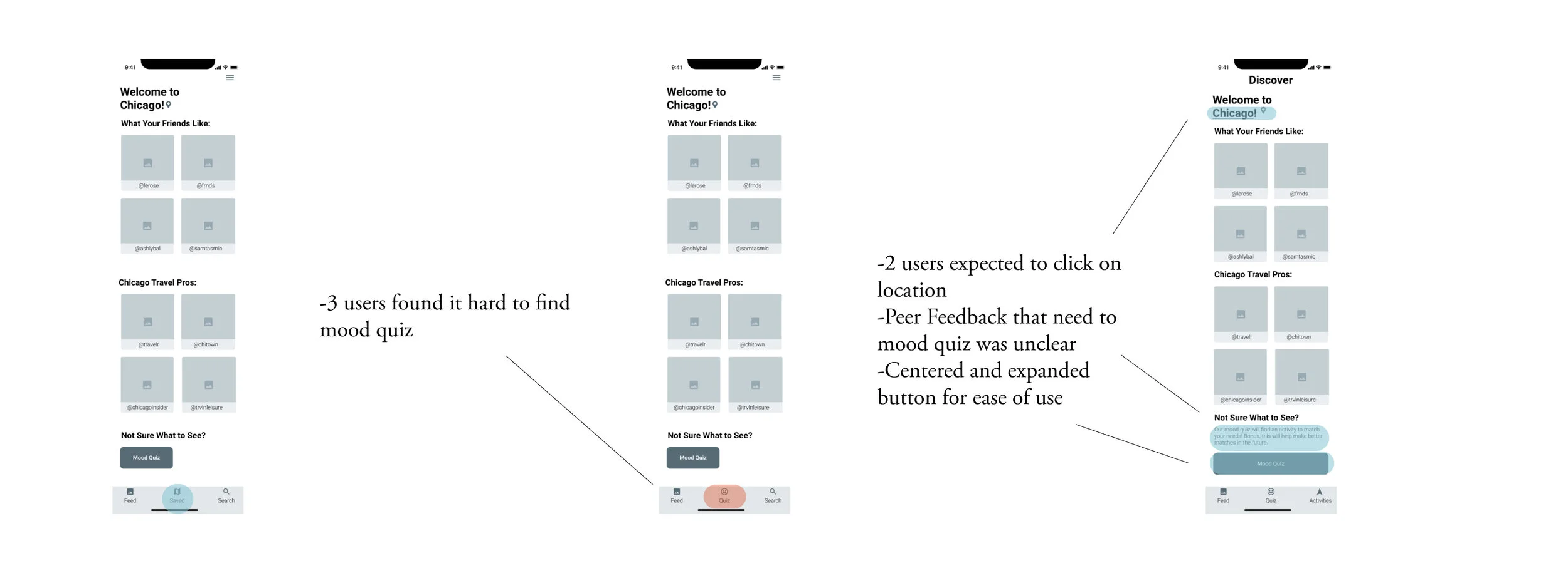
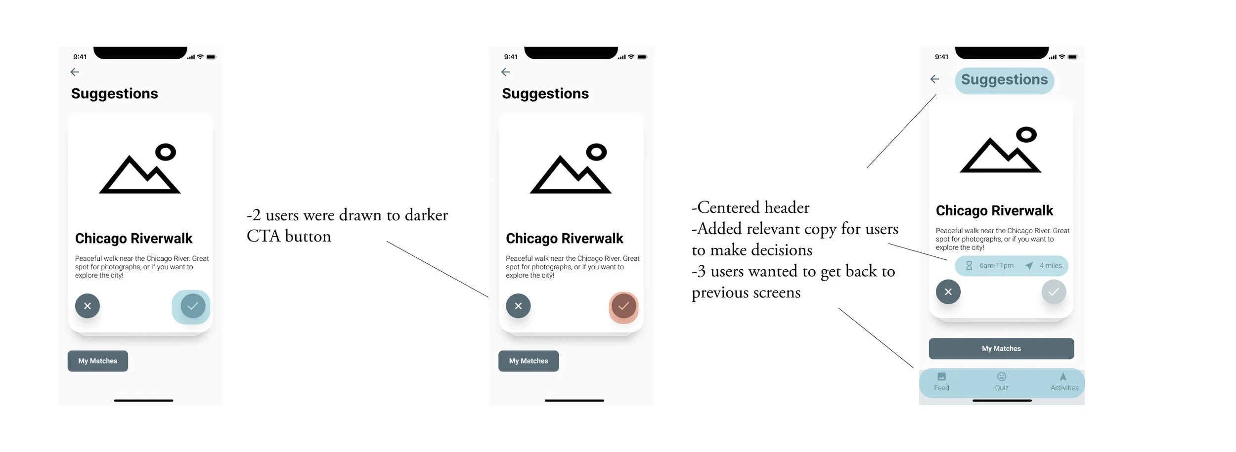
User Testing
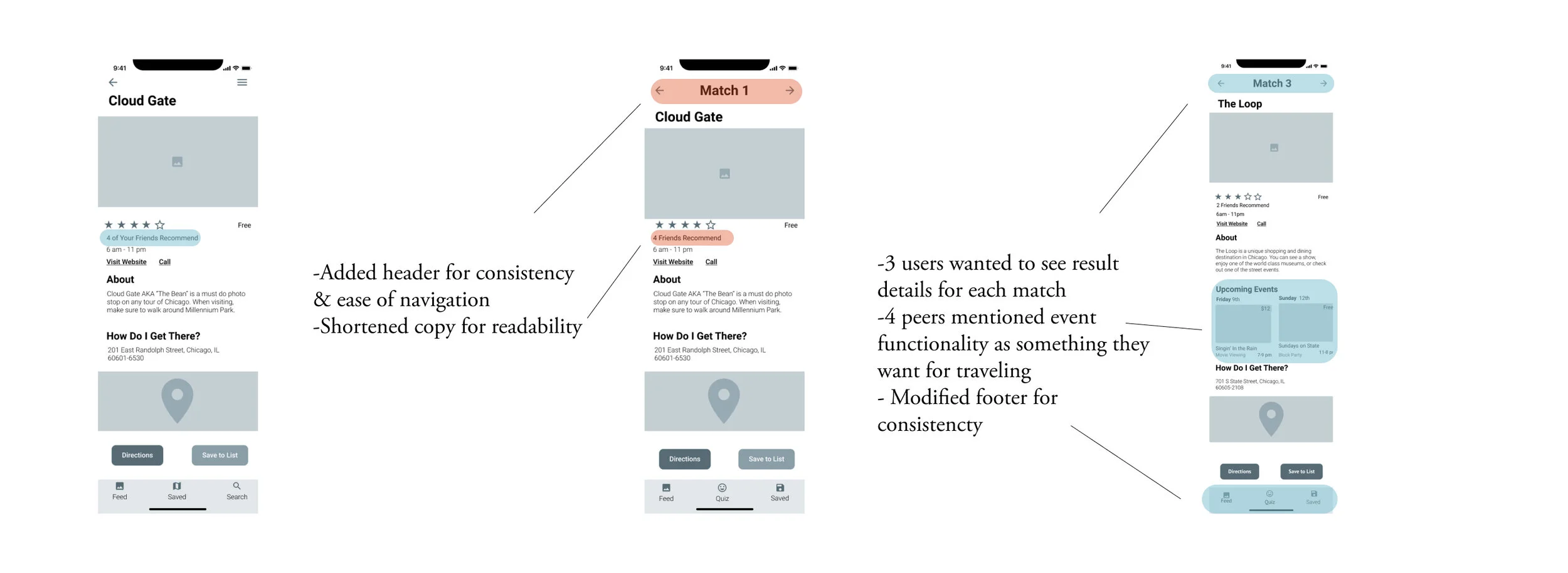
After developing my prototype, I was excited to put it in front of users to test the usability of my designs. Just because I had been staring at these prototypes for weeks, doesn’t mean they will make any sense! I created a comprehensive testing script and conducted 2 rounds of testing with 10 separate users over zoom calls.
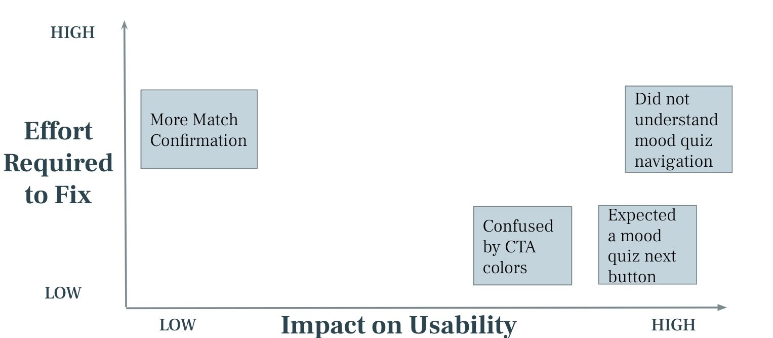
Prioritizing Insights
I got such great feedback from my usability interviews, but with only so much time, it was important to prioritize changes that would make the biggest impact with the least amount of effort.
Mid-Fi Revisions
I am a strong believer in the importance of feedback! To further refine my prototype, I reached out to peers and instructors for additional feedback.
Version 1 Version 2 Final Revision

Deliver
After incorporating all of the peer and user feedback, I was confident to move on to the next and final stage of the triple diamond delivery!
Brand Identity
In discovery I focused on the needs of my persona and my competitors, in development I explored the needs of my persona, and now I focused on melding all of these needs to establish my unique brand! I first established adjectives inspired by Katherine’s attributes to describe my brand:
-

Curious
-

Adventurous
-

Free
-

Urban
-

Explorative
Moodboard
Now that I have an idea of what makes up my brand, I gathered photos and colors which would reflect the overall “mood” of my app. I then paired my initial 20 pictures to 7 key photos that represent the mood of my travel application. I was inspired by the movement, architecture and feel of modern city exploration.


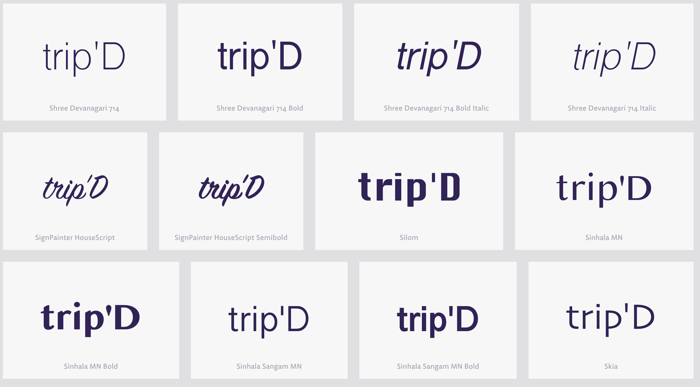
Naming & Wordmark
Referring to my project as “that travel app”, wasn’t going to cut it anymore, I had to decide on a name! I did a quick poll with some of my options and decided on trip’d, a catchy name that invoked the casual nature of my application. Users are invited to discover their city and spontaneously find great activities.
After creating the name, I created a distinct wordmark and icon to establish my brand. I was inspired by playful wordmarks that displayed the motion and fun I wanted to imbue in my application.


Prototype
The big moment is here! I injected colors from my brand inspiration, in addition to neutrals for minimalism and readability. I used the 60-30-10 rule which states that 60% is the dominant color, 30% is the secondary color and 10% is an accent.

With More Time I Would:
Expand functionality and integrate the other user epics into my application starting with Discovery, a key feature I found in my user research
Conduct a user survey to get more quantitative data